Justifying the Nook: A case for PDF
I’ve had my Nook for about two months now, and have read about 8 books on it so far. It’s a great little device that I’ve been unable to put down in my spare time. My only real gripe is that, like almost every other e-reader out there, it has such poor typesetting that you have to wonder if it was designed by software engineers who aren’t big readers—it certainly provides the paper look, but it’s still got a long way to go to provide a reading experience equal to a dead tree book.
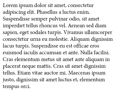
To give an example, there are currently two types of books you can buy on the nook: those that are left-aligned, and those that are justified.

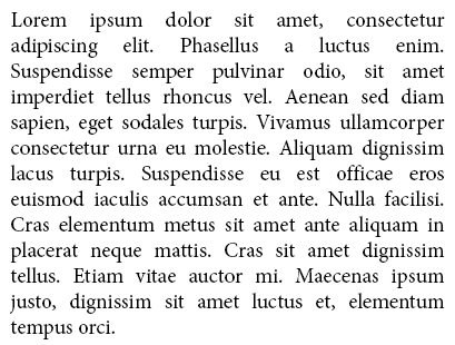
Here’s the left alignment. It’s readable, but it wastes a lot of space on the right edge and isn’t very aesthetic. Next we have the justified version:

This kind of very basic justification is pretty poor looking—in attempting to create a nice straight margin, it adds a bunch of ugly space between words. This is the same kind of justification web browsers do, and almost nobody uses it because it looks so bad. I knew about this going in. Science fiction author Robert J. Sawyer wrote a very informative post about it, and I set about finding a way to solve this problem before my nook even arrived in the mail.
One great feature about the nook is that it supports viewing PDFs, with and without re-flowing text. With re-flowing turned off, you’re free to manually typeset the document any way you want, and it will appear exactly how you want on the screen. This is what I was looking for. With this you can use Microsoft Word to create a great looking PDF. If you’re feeling brave and want even better looking text, professional typesetting software like Adobe InDesign provides more advanced features that will give fantastic results.

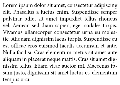
Here we can see proper hyphenation and justification. A good justification algorithm won’t just add more space between words, but will also be willing to shrink it just slightly if it will make things look better. You can see this in the first line of text, where it fits “adipiscing” in to remove the whitespace that plagued the text in the previous image. It also evenly spaces the entire paragraph at once instead of just a single line, and fits more text into each line by hyphenating words on line breaks.
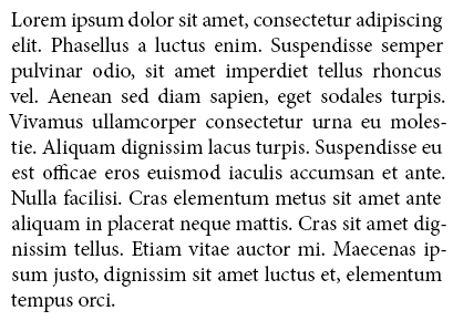
It’s looking pretty good now, and is almost like a real book. But there’s a little more that can be done:

Can you spot the difference? I admit, without a keen eye and a little knowledge of typography, I won’t expect most people to. Here’s an animation to help show the differences better:

There are two things happening here, one more subtle than the other. The first is optical margin adjustment. This improves aesthetics by adjusting each line’s margins ever so slightly to reduce empty space, giving a more flat look to edges. You can see it on the fifth line, where it compensates for the empty space under the V’s left edge by moving it out a little bit. It’s even more noticeable with punctuation on the right edge, where it pushes the periods and hyphens out into the margin.
The second thing happening is ligature substitution. Certain combinations of characters have similar fine details in the same spots and can look a little awkward together, and ligatures can make them look better by combining them into a single specialized glyph. You can see this in the middle left of the text, where “officae” is slightly altered—look closely at the “ffi” and you will see the three letters merged together with the first F becoming a little smaller and the dot over the I merging with the second F to create a slightly larger overhang. Look in your favorite dead tree book, and you’ll probably find it in “ff” and “fi” combinations—it’s pretty hard to notice without looking for it, but it is used to subtly improve legibility.
There is nothing about EPUBs that prevent e-readers from performing this kind of typesetting automatically. With any luck, one day we’ll get this nice look in all the e-books we can download. The fault is solely within the e-reader’s software. Until they start to take typesetting seriously, the only way we’ll get this is with PDFs. Unfortunately, most e-books aren’t legally available without DRM, making this kind of dramatic alteration impossible with most of the stuff you can buy.
It’s easy to say this isn’t very important. After all, it doesn’t affect functionality, right? You can still read the first picture! When you’re doing a lot of reading, it is important. Proper text flow reduces eye movement and takes less work for your brain to process, letting you read longer and faster. It also happens to get significantly more text onto each page, which means fewer delays from page turns—in my experience, it reduces a book’s page count by around 15%.
There are a lot of compelling reasons to get an e-reader. They can store thousands of books at once and remember your place in each one of them. You can look up unknown words in a dictionary, and bookmark stuff for later reference without drawing all over a page with a highlighter. You can browse through massive book stores and read bought books instantly without ever leaving your home. It baffles me that they don’t bother to improve the single most important part of the device—reading!
